Residence | Rotterdam
Rotterdam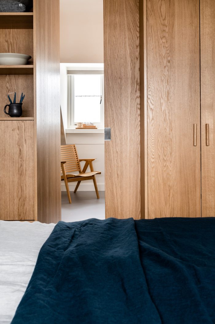
Our clients contact us to thoroughly renovate the two top floors of their 1930s home. They wanted to realize a number of wishes with this renovation, including a second bathroom and a private floor for the parents and the two children in the family. The form in which this will be realized was still completely open. This gives us plenty of creative energy to work with the wishes and needs of the customer.
Our usual method for projects like this always starts with an inventory of the wishes and needs. This is not a simple list with a summary of functions for the rooms or a global impression of the desired style. Through the conversations we delve into the living habits and needs of all residents. We then look carefully at the space that is available. We puzzle over how that space can be used most optimally, not only functionally but also fits the residents. Finally, we add a Design Studio Nu look and feel to the designs. In addition, we find it important that the atmosphere and appearance of the space remains beautiful for a long time and that it matches the taste and preferences of the residents.
Scroll down to read more, under the images of this project
Credits
Interior design, implementation, realization and supervision by Design Studio Nu
Photography Rachel van Loenen | Studio Artspret
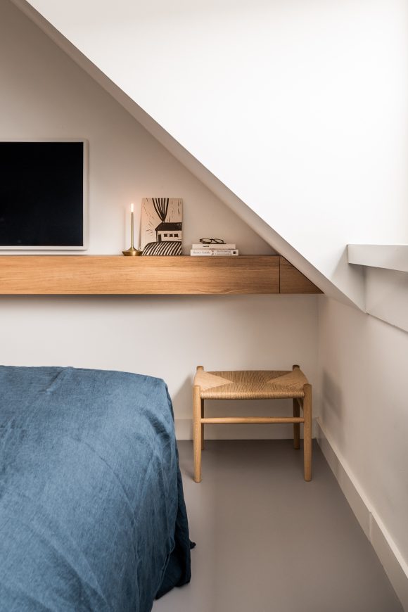
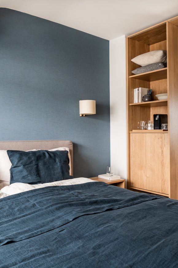
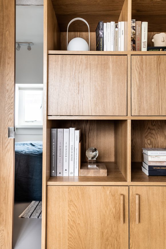
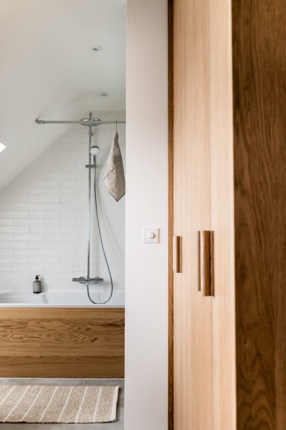
Bedroom en suite
We present the design with several choice options. The floors between parent and child were separated, each with its own floor. With two floors there were two options: we made a design for both. The clients were pleasantly surprised by the option whereby they themselves would sleep in the attic. We have successfully applied this division of functions in projects before. It allows parents to withdraw and watch over the whole house. Children experience the freedom on their own floor to play and be together.
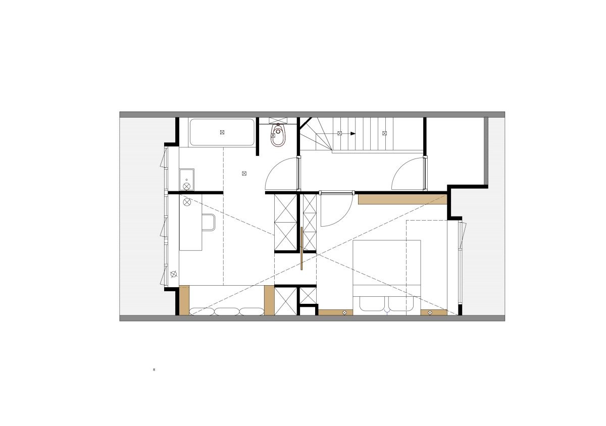
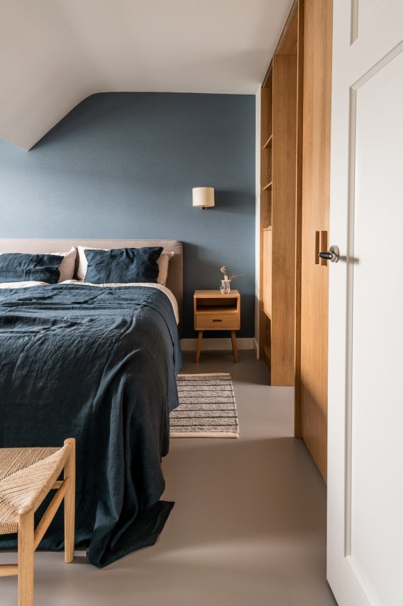
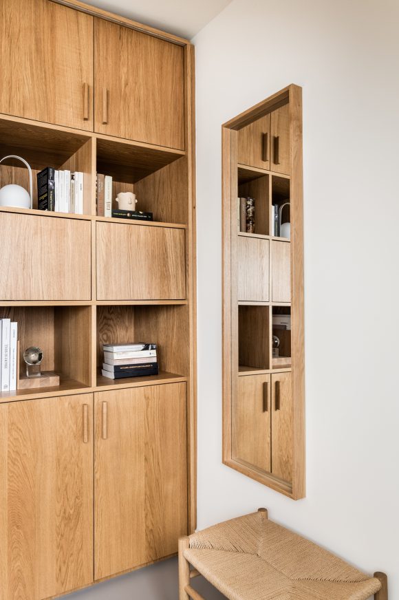
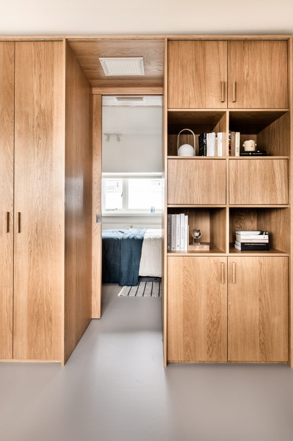
The attic floor was also furnished with a layout that is comparable to a spacious hotel room or suite. A custom-made wardrobe, a design inspired by the characteristic en suite, separates the bedroom from the home workplace. The cupboard itself offers enormous storage options and the separation gives you peace of mind in both rooms. The sliding door can be left open so that the light can continue to reach both rooms. If more separation is required, then closing the door is sufficient. The bathroom is also accessible from both rooms. This is practical but also gives the feeling of space because all areas remain connected.
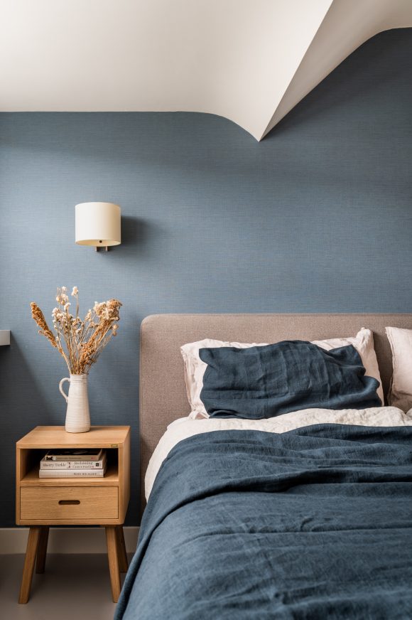
We chose timeless materials that match the 1930s character of the house. The oak wood of the cabinets gives warmth. The floor has a cooler shade and is also practical to use. For the wall behind the bed, we opted for a beautiful wallpaper with texture. The linen bedding is a wonderful finishing touch that gives clients the feeling of staying in a luxurious hotel room.
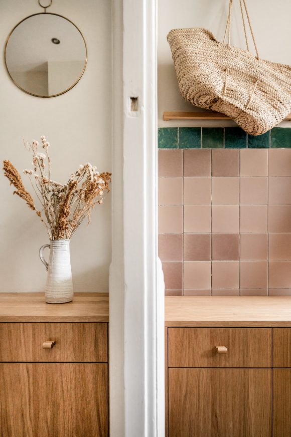
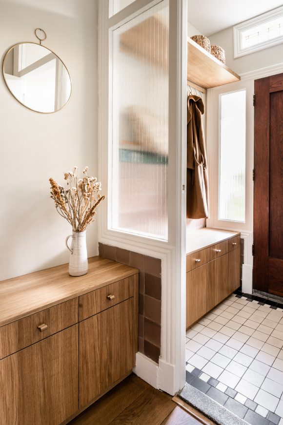
We also made a design for the entrance and hall on the ground floor. Often this space is a bit forgotten and it pays to pay attention to it. After all, you step into your home there and it is nice if that space is neat and warm to the touch. We designed a custom piece of furniture with sufficient storage space and four Pegrails with s-hooks were given the function of a coat rack. The design matches the original 1930s details. We also chose the material for the cladding on the stairs. The beautiful staircase connects the spaces and ensures that the house feels like new.
Are you curious about the floor for the children? We made it a separate portfolio item. You can read more about it here.
Ontwerpdetails
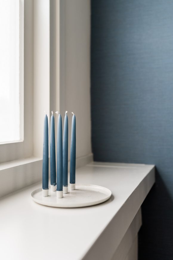
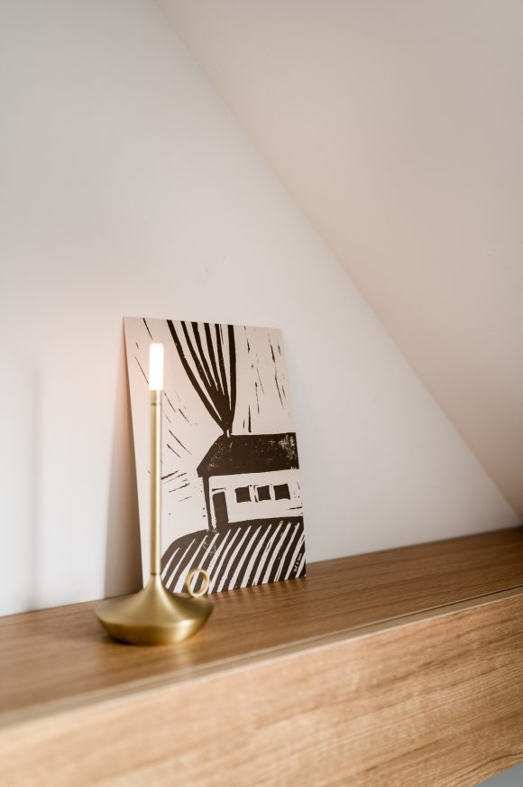
Wooden Handles Stick van Design Studio Nu | Custom designed cabinets designed by Design Studio Nu, realization by Houtwerk | linen bed covers By Mölle | Stool by FDB Møbler | Chair by Rex Kralj | Candle holder Wick by Graypants
In 2021 we had the first and second floor of our 1930s house renovated. We wanted to create a separate floor for our sons and a separate floor for ourselves. Design Studio nu guided us very well from start to finish. That started with making two designs, one where we would sleep on the first floor and one where we would sleep on the second floor. In the end we chose to sleep in the attic ourselves and our sons were given two spacious, sturdy boys' rooms on the first floor. We are very happy with our loft attic, which has a hotel-chic appearance, allowing us to relax in the attic and literally distance ourselves from the daily routine of the household. The eye-catcher is the beautiful oak custom cabinet that you can walk through and two separate spaces have been created.
Design Studio Nu has really based the design on our need and on how we like to live. That was an enormous added value for us. And Design Studio Nu has literally ensured the realization of the idea from the initial meeting to the finishing touch. What was also nice about the collaboration with Design Studio Nu is that Tessa and Nathalie have thought along down to the smallest details, so that it is now really finished. And Tessa and Nathalie are just nice people with whom the contact is always nice and cozy.

